
Instructor David Nolan, Ph.D.
Week of June 15
We are taking a brief look at User Experience (UX) design in this module. Understanding users and their behaviors leads to being an effective creator of digital products. If you aren’t in sync with your end users, there is little chance that you will understand their needs or meet their expectations. By understanding the psychology of users, you can take measures to address their pain points. Getting an insight into human behavior and motivating factors gives you the ability to add more value to what you have to offer.
Objectives
- Understand the details and differences between User Experience and User Interface Design, the seven factors that influence users, and the five characteristics of usable products.
- Analyze a website and be able to recognize the good and bad UX/UI principles involved in its design.
Instructor Videos
Watch & Read
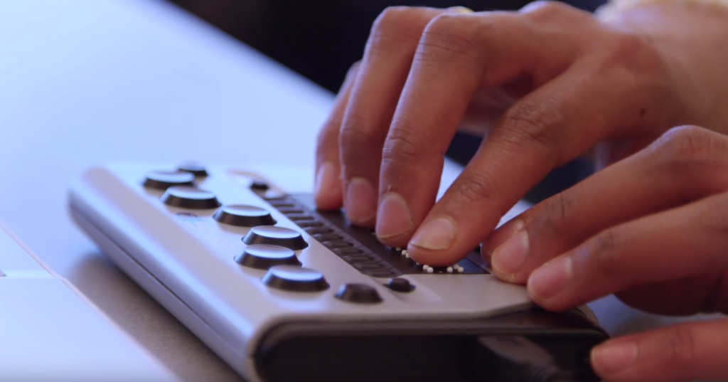
View a short video “Understanding the diversity of users” with Victor Tsaran, Technical Program Manager, Accessibility Initiatives at Google. Born in Ukraine when it was still part of the Soviet Union, Tsaran had no idea as a child that he would one day move to the United States, see his life transformed by computers, and work for some of the leading tech companies in Silicon Valley, making the world a more accessible place. (4 minutes)
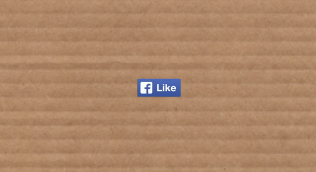
View a TED Talk: “Margaret Gould Stewart: How giant websites design for you (and a billion others, too)” Published in March 2014. Facebook’s “like” and “share” buttons are seen 22 billion times a day, making them some of the most-viewed design elements ever created. Margaret Gould Stewart, Facebook’s director of product design, outlines three rules for design at such a massive scale—one so big that the tiniest of tweaks can cause global outrage, but also so large that the subtlest of improvements can positively impact the lives of many. (13 minutes
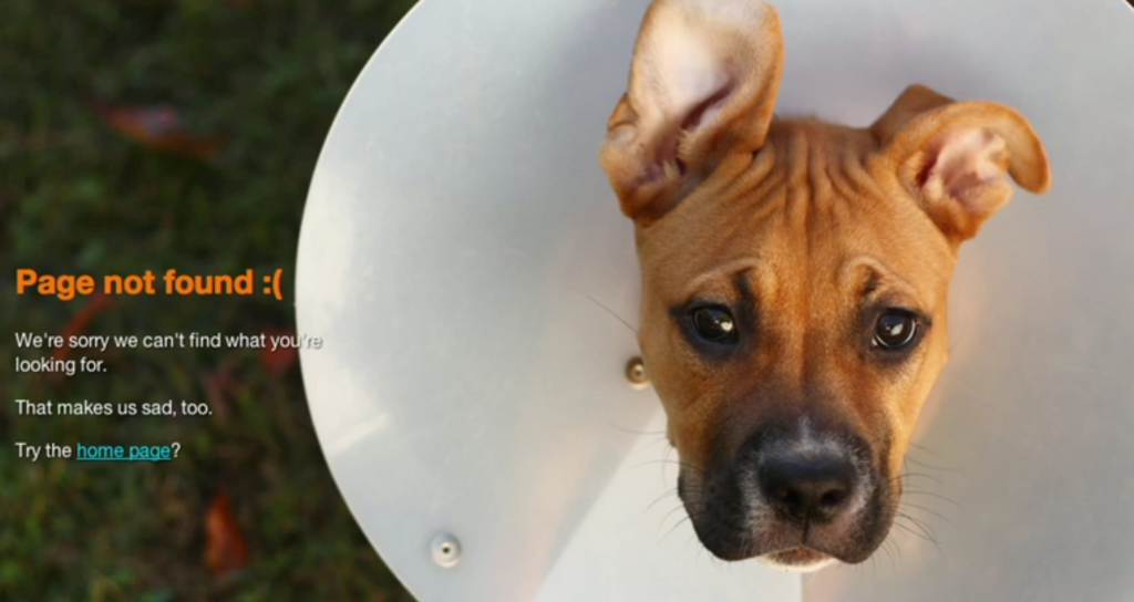
View a TED Talk: “Renny Gleeson: 404, the story of a page not found” Published in February 2012. Oops! Nobody wants to see the 404: Page Not Found. But as Renny Gleeson shows us, while he runs through a slideshow of creative and funny 404 pages, every error is really a chance to build a better relationship. (4 minutes)
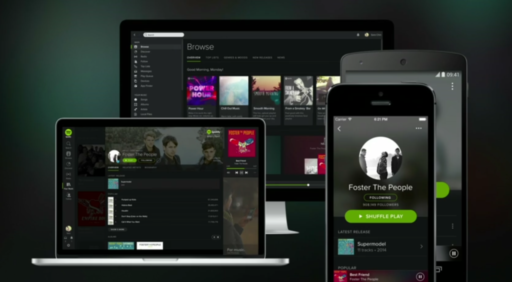
View a TED Talk: “Rochelle King: The Complex Relationship Between Data and Design in UX” Published in October 2014. Engineering a website is equal parts vision and adaptation … responding both to how users navigate the site and what new goals of the organization have emerged. Rochelle King, the senior designer at Spotify, was recently challenged to combine the many mismatched interfaces of Spotify into a single harmonious layout. She walks us through the process of redesigning a major website, revealing best practices for navigating the relationship between designers, data and the people for whom it is built. (12 minutes
I suggest you read the following books for a better understanding of some of the concepts we’ve discussed:
100 more things every designer needs to know about people (2016) by Susan Weinschenk. New Riders; Berkeley, Calif. ISBN 9780134196039
Don’t make me think, revisited: A common sense approach to Web usability 3rd Edition (2014) by Steve Krug. New Riders; Berkeley, Calif. ISBN 9780321965516
Discussion
As technology becomes increasingly multi-channel, multi-device, and pervasive, the experience of technology becomes more complex. Companies are now recognizing this complexity, and most of them are hiring UX designers to make sense of, organize, and design experience with brands, products, etc. UX designers are in a unique position to work across many different functions, collaborating with many other teams to shape how to solve users’ problems. By reading, viewing and discussing the writings and works of UX and UI professionals, journalists, artists, Web developers, photographers, usability experts, graphic designers, educators and researchers you will deepen your appreciation for each distinct media form.
Exercise: Analyze a Website
We naturally form opinions about the websites we visit. Some of them we love so much that we come back several times a week, and others leave us with a bad experience that causes us to never return. But what is it that determines whether a website is good or bad? As individuals we each have our own opinions and we’ll never completely agree on which websites are good and which ones are bad, but most of us will base our feelings on similar factors.
Parameters: Identify what is good and bad interface design, navigation, functionality, interactivity, content distribution in a website. Choose a web site and write a list of at least 10 informed reasons why it is good and at least 10 informed reasons why it is bad. Use the “Good & Bad Web Design Features” list below by Robin Williams. Share your findings and discuss on this week’s Slack Channel #userexperience.
Good Web Design Features – One of the elements of good web design is a lack of the elements that make bad web design. If you stay away from everything listed on the page about dorky web pages, you’ve probably got a pretty nice web site. In addition, keep these concepts in mind:
Text
- Background does not interrupt the text
- Text is big enough to read, but not too big
- The hierarchy of information is perfectly clear
- Columns of text are narrower than in a book to make reading easier on the screen
Navigation
- Navigation buttons and bars are easy to understand and use
- Navigation is consistent throughout web site
- Navigation buttons and bars provide the visitor with a clue as to where they are, what page of the site they are currently on
- Frames, if used, are not obtrusive
- A large site has an index or site map
Links
- Link colors coordinate with page colors
- Links are underlined so they are instantly clear to the visitor
Graphics
- Buttons are not big and dorky
- Every graphic has an alt label
- Every graphic link has a matching text link
- Graphics and backgrounds use browser-safe colors
- Animated graphics turn off by themselves
General Design
- Pages download quickly
- First page and home page fit into 800 x 600 pixel space
- All of the other pages have the immediate visual impact within 800 x 600 pixels
- Good use of graphic elements (photos, subheads, pull quotes) to break up large areas of text
- Every web page in the site looks like it belongs to the same site; there are repetitive elements that carry throughout the pages
- Bad Web Design Features
Bad Web Design Features – Below are features that can make a web design look dorky. These are not just my personal opinions, but are ideas I have collected from speaking to groups around the country. Examples of many of these features and more detailed explanations of the problems and solutions are in my book, The Non-Designer’s Web Book, written with John Tollett.
Backgrounds
- Default gray color
- Color combinations of text and background that make the text hard to read
- Busy, distracting backgrounds that make the text hard to read
Text
- Text that is too small to read
- Text crowding against the left edge
- Text that stretches all the way across the page
- Centered type over flush left body copy
- Paragraphs of type in all caps
- Paragraphs of type in bold
- Paragraphs of type in italic
- Paragraphs of type in all caps, bold, and italic all at once
- Underlined text that is not a link
Links
- Default blue links
- Blue link borders around graphics
- Links that are not clear about where they will take you
- Links in body copy that distract readers and lead them off to remote, useless pages
- Text links that are not underlined so you don’t know they are links
- ..(If you’re not going to underline your links, please make darned sure
- ..that each link is perfectly clearly a link! Don’t make me wander around
- ..with my mouse checking to see if randomly colored text is a link!)
- Dead links (links that don’t work anymore)
Graphics
- Large graphic files that take forever to load
- Meaningless or useless graphics
- Thumbnail images that are nearly as large as the full-sized images they link to
- Graphics with no alt labels
- Missing graphics, especially missing graphics with no alt labels
- Graphics that don’t fit on the screen (assuming a screen of 800 x 600 pixels)
Tables
- Borders turned on in tables
- Tables used as design elements, especially with extra large (dorky) borders
Blinking and animations
- Anything that blinks, especially text
- Multiple things that blink
- Rainbow rules (lines)
- Rainbow rules that blink or animate
- “Under construction” signs, especially of little men working
- Animated “under construction” signs
- Animated pictures for email
- Animations that never stop
- Multiple animations that never stop
Junk
- Counters on pages — who cares
- Junky advertising
- Having to scroll sideways (800 x 600 pixels)
- Too many little pictures of meaningless awards on the first page
- Frame scroll bars in the middle of a page
- Multiple frame scroll bars in the middle of a page
Navigation
- Unclear navigation; over complex navigation
- Complicated frames, too many frames, unnecessary scroll bars in frames
- Orphan pages (no links back to where they came from, no identification)
- Useless page titles that don’t explain what the page is about
General Design
- Not responsively designed
- Frames that make you scroll sideways
- No focal point on the page
- Too many focal points on the page
- Navigation buttons as the only visual interest, especially when they’re large (and dorky)
- Cluttered, not enough alignment of elements
- Lack of contrast (in color, text, to create hierarchy of information, etc.)
- Pages that look okay in one browser but not in another
Other Stuff to Consider
Are there incoherent design choices? This might sound harsh, but the fact of the matter is that a lot of websites we see feel as if they were designed and constructed by half a dozen different people (and they might have been, with successive revisions over time). Pages within a website should look like they belong together; inconsistencies in sizing, fonts, or colors might not seem obvious at first, but they make a poor impression on visitors.
Is key information buried? On every page in your website, key information and details should be “above the fold,” meaning that the user shouldn’t have to scroll around the page to find them. When that’s not the case, your website feels cumbersome, confusing, and difficult to use.
Are there difficult navigational structures? There are a handful of different navigational structures and menu types that searchers and visitors are used to. Once you stray away from these, people have to think about what they’re doing when they use your website. That can be frustrating, and detracts from your message.
Are unconventional colors used? Lots of people want to think “outside the box” when it comes to website design, but you have to be careful when it comes to color choices. There’s only a slight difference between something that makes your pages “pop” and coloring that’s distracting and irritating to visitors.
Are there low-quality graphics and unreadable fonts? Amazingly, we still see webpages using clipart from decades ago, or are built with fonts that are either hard to read or can’t be displayed correctly by modern web browsers and mobile devices. These send an instant message to visitors, and it isn’t that your group should be taken seriously.
Is there a lack of mobile compatibility? More than half of all web users access the Internet through tablets and smart phones. If your webpages don’t display properly for them, then you can’t be surprised when you aren’t getting the kinds of results you planned for.