Instructors: Kelly Kaufhold & Amber Hinsley
June 13-17
Zoom June 17, 1-5pm CT
Description
This week, our focus is on reviewing different types of data, finding open data sources, and learning to use free data visualization tools. We’ll also show you how these data visualizations can be embedded on different publishing platforms.
Outline
I. Discrete v aggregate data
II. Places to find data
III. Using various data visualization tools
IV. Q&A with a TXST alum (& former journalist) who used data journalism skills learned in class to create a multimedia project

Online Exercises & Materials
Asynchronous work to complete before 1 p.m. June 17
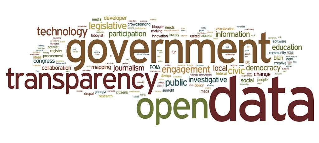
“Data” comes in 2 major categories:
- “Discrete” data (1 “case” at a time)
- “Aggregate” data, which is many cases all lumped together
Some examples of Discrete data are:
- Property tax records, to compare one house or company with another
- University spending (the Texas Tribune has this fun one comparing Texas university athletics department budgets)
- State tax incentives to lure new businesses
- Jail & prison inmate records (the Miami Herald did a heartbreaking package of stories on hundreds of individual inmates in Florida’s largest prison for women)
We’ll concentrate on Aggregate data in this session – telling a story by analyzing hundreds, thousands or even millions of cases. Some Aggregate examples include:
- U.S. Census or FBI Uniform Crime Statistics data
- Health data (like infection or vaccination rates)
- Voting patterns
- The New York Times has a whole data team and regularly turns out big-data interactives, like this one on vaccination rates in each of the 3,006 counties across the U.S.
- The Guardian also often visualizes interactive aggregate data, like this map using colors to show level of support for Brexit by neighborhood across the U.K.
Start by watching this video which is an introduction to the history and some examples of both kinds (Discrete and Aggregate) of data journalism.
You’ll get a look, below, at some easy, free tools to create data visualizations and we’ll also practice those in class this Friday. But the first thing your students will need to do to write a data journalism story or create a data visualization is to find some data. As I mentioned in the first lecture video, there’s more free data online than ever before and it’s growing every day. There actually is an elegant way to search online for just dataset (like Excel spreadsheets, or “Comma Separated Values” data – CSV.) In this next video, I show you how to search for Excel data online and how to sort it to start to tell a story.
IF you’re already familiar with Excel spreadsheets, including Pivot Tables for comparing multiple variables, you can skip the next couple of videos and go see how to customize a Google Map and build interactives in Google Flourish. But if you’re new to Excel, you’ll totally benefit from these two.
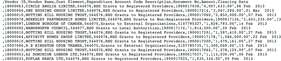
If you can’t find what you’re looking for with a “filetype:xls” search you may want to try searching for “Comma Separated Value” or “CSV” data. Automatic online systems (like the Census or Bureau of Labor Statistics) often generate CSV data rather than Excel. It looks scary (see below) but CSV data will usually open just fine in Excel – then just save it as an Excel file (.xlsx) and you’ll be ready to proceed.
In that previous video, I showed you how to sort by different columns, which can be really useful. But what if your data set is more complicated? For example, imagine national data on COVID cases but with these variables: States; vaccinated or unvaccinated; different age categories… that would be harder to interpret just by sorting one column or another. But there’s a great tool built into Excel that lets you sort and compare two, three or more variables. I show you that tool – Pivot Tables – and a quick look at doing math in Excel (adding up a column and figuring out an average).
![]()
This next tool is one we’ve all used – Google Maps. But did you know you can quickly add YOUR data to Google Maps, then share and embed that customized map with your data in it? It’s actually really easy and I usually have my students help me create a dataset – I’ll do the same thing with you.
I usually build an online spreadsheet in Google docs which I make public for editing, then I ask my students to go to that sheet (at a link I provide) and enter the following data about their favorite restaurant: The Name; Address (copied from Google Maps, because Google Maps is really finicky about the format of addresses – for example, they don’t spell out “street” or “drive” and don’t use punctuation, like “St.” A typical Google Maps address looks like this: 601 University Dr, San Marcos, TX 78666 (that’s Texas State’s address).
I set up a Google Drive folder for PhDigital that has 3 datasets in it that you can go practice with – they’re the same data sets I used in these demo videos. I want YOU to go to that folder and enter 2 things:
- The Name and Address of your University and how many students are enrolled there on this Google Sheet (you’ll see my example on the first line);
- A photo that represents your University (for example, the Old Main building here at Texas State) in the “Your university photo” folder in Google Drive.
We’ll use your data and photos to quickly build an interactive Google Map when we meet for class later. You do not need to create a Google Map before class. For future reference, here’s the link to use to create a new Google Map by uploading your data:
And here’s a video demonstrating how to upload simple location data into Google Maps and do a little customization of that data – it can be really fun to have a student in class build this interactive map as you talk them through it, rather than doing it yourself!
![]()
Here’s the link for the next free tool I’ll show you – Google Flourish, https://flourish.studio. If you have a Gmail, you can log in with that but it will work with any email. This is a robust data interactive tool that offers all kinds of options: bar charts, line graphs, pie graphs, maps… all interactive using your data. There are some pitfalls built into Flourish but I show you what they are and show you some simple ways to overcome them.
Before class on June 17, you should find a dataset of interest to you (really, it can be anything) and practice building a Google Flourish on your own. Then go to the #datajournalism Slack channel and post a link to your Flourish, upload the dataset file, and explain one fact you learned from the data when you created the visualization.
![]()
To-do list of homework to do before start of class June 17
- Watch tutorial videos on this page
- Enter your university info and photo into the Google Drive
- Find a dataset that interests you and create a visualization in Flourish
- Post a link to your Flourish in the #datajournalism Slack channel, upload the dataset file, and explain one fact you learned from the data when you created the visualization
![]()
Live Zoom class outline for June 17
- You’ll help us build an interactive Google Map using your data and images
- Show & tell for the Google Flourish chart you created on your own
- Explain where you got the data you used and how you decided which chart to use
- Other examples of Google Flourish charts
- Exploring StoryMap to create a different kind of map
- Using Google Sheets to create a Timeline
- Scraping data from a website to create a Flourish chart
- Fun with Google Trends
- Q&A with Yoojin Cho, a recent Texas State graduate (who’s a former journalist and current public information specialist for Travis County) who will explain how she used data journalism skills to access a county database and download data, clean the data and analyze it, and then produce a multimedia story with data visualizations.
Module Evaluation
After each module, you will be asked to do an evaluation. Go to the link for the PhDigital 2022 Zoom Modules Evaluation and select the module you are reviewing. Please do this as soon as you can after the Zoom session.
Moving ahead – next week we’ll talk about Social Media & Analytics with Jon Zmikly and Dale Blasingame.